As a comic writer turned editor/letterer, it wasn’t until I started lettering that I realized how important a lettering pass is. Adding a lettering pass to your scripting process will make you a better collaborator, cut down the time that your letterer spends on extra stuff that isn’t important, and help your team hit deadlines. If you want to be the sort of writer that letterers love working with, these tips will be helpful. As writers, our goal should always be to make the creative process easier for our collaborators.
So what is it? The lettering pass is a review of the script that should happen when you get your art back from the artist or colorist. The writer should go through the script and, at a minimum, make sure the script matches what the artist drew, and that the script is free of errors.
Most letterers can letter over black and white pages, but many of us prefer full color so we can match the palette when creating SFX and other things that might need color.
This post will include information that can be helpful to any of your collaborators, but I wanted to focus specifically on lettering. If you want to do a true deep dive into the lettering process, I recommend The Essential Guide to Comic Lettering by Nate Piekos.
Until you can give that a read, I hope this will help you understand some of the basic things that will make it easy on your letterer and ensure your comic looks fantastic! I’ve even made a printable PDF document you can use to check things off the list, with helpful visual reminders. You can find it at the bottom of this post.

8 Things To Check Before Handing Your Script And Art Over To Your Letterer
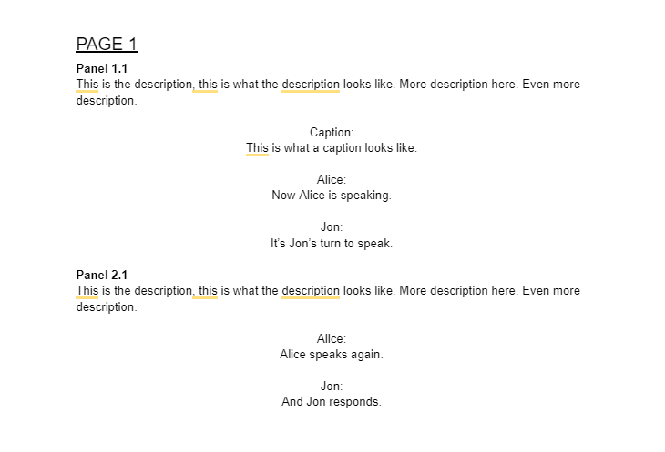
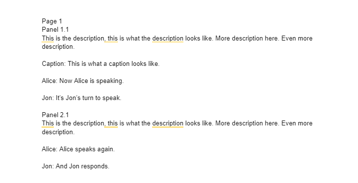
1. The script is formatted and easy to read.
In comics, there are no strict rules on what a comic script needs to look like, but I can tell you a few things that will help or hinder your collaborators:
Help: Page breaks for each comic page. Descriptions and dialogue/captions are visually distinct, either via numbering or alignment. Page/panel number using either headings or bolding to clearly show new pages/panels.
Hinder: No formatting at all. All text is the same weight. No page breaks. No line breaks for dialogues/captions.
2. The script matches the art on the page.
If the artist has made changes to the script (adding panels, removing panels, not leaving space for text, etc), your script should reflect those changes so the letterer doesn’t have to guess or email you several times to figure out what you want lettered on the page.
3. Use a document type that can easily be copy/pasted from.
I personally prefer either Google Docs or Word Docs. These document types make it easy for your letterer to copy/paste your dialogue and captions directly into their lettering document, which can avoid a ton of errors. Most letterers don’t like PDFs, because they formatting and are not easy to copy/paste from, so I would avoid using them with letterers. Even if the letter can copy/paste from the PDF, I’ve found it adds paragraph and line breaks that I have to account for and fix, which adds extra time to the lettering process.
4. Proofread your script and correct errors before sending it to the letterer.
Your lettering may do basic proofreading, but it’s really not their job to make corrections. You want to avoid making proofreading corrections once the pages are lettered. If you are asking for proofreading corrections to lettered pages, you will be adding extra, unnecessary work for your letterer. Adding commas and correcting the script takes a few seconds, making multiple corrections to various pages could take several minutes to an hour or more for your letterer, depending on the amount of corrections.
5. Less is more, or at least it can be, when it comes to text in comics.
A good rule of thumb is that you can have about 210 words per page without the page looking too full. This is a guideline, not a rule, but I will tell you if you fill entire pages repeatedly with as many words as possible, you will likely stress out your letterer and possibly your art team. Rely on the art to tell the story, that is the magic of comics. Some of the best comics I’ve worked on and read have far fewer words per panel than what’s listed here. Overfilling your panels will make your comic look older, because that was more common way back when.
Basic rules to follow (and break, once in a while):
26 words per balloon (Alan Moore)
3 balloons per panel (Warren Ellis)
3 lines of text per balloon (Ed Brubaker)
Divide 210 by the number of panels. For example, 4 panels – 52 words per panel.
6. Avoid ALL CAPS when scripting.
It’s really difficult to read (I say this both as an editor and a letterer, you don’t want barriers like this for your collaborators). Letterers will advise you not to use it in dialogue, but personally, I don’t love it in descriptions either. You want your script to be easy and accessible to read.
7. The first speaker is generally on the left side of the panel.
This rule can be broken, but break it sparingly. If you are constantly putting the first speaker on the right side, the letterer is going to have to get creative to make sure the reader knows who is speaking first. If you have multiple speakers, check the order of their speaking vs. how they are drawn on the page, and swap things around if you need to.
8. Include the printing dimensions for your comic.
Comic printing companies usually have a guide on their website that gives you an exact idea of what the comic size will be and what their bleed/trim/safe zone is for it. A professional letterer will create their lettering template to match those exact specifications, which will ensure that nothing gets cut off during the printing process. Jamie McKelvie has a great post that outlines the importance of printing dimensions and bleed/trim/safe zones here.
Checklist PDF
Grab the printable PDF Checklist here, the preview of it is below.